Lea Alcantara: This is the ExpressionEngine Podcast Episode #52 where we talk about mobile sites with EE. I’m your host, Lea Alcantara, and I’m joined by my co-host, Emily Lewis. This episode is sponsored by EECI 2011. EECI is up for its 5th season and this time it’s returning to…
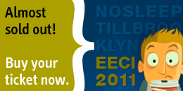
Lea Alcantara: This is the ExpressionEngine Podcast Episode #52 where we talk about mobile sites with EE. I’m your host, Lea Alcantara, and I’m joined by my co-host, Emily Lewis. This episode is sponsored by EECI 2011. EECI is up for its 5th season and this time it’s returning to the United States of America the most significant conference where ExpressionEngine developers, designers and users will run from October 19th to the 21st at the Invincible Dog in Brooklyn, New York. A few tickets are still available so check out EECIConf.com for more details.
Emily Lewis: The ExpressionEngine Podcast would also like to thank Pixel & Tonic for being our major sponsor of the year. So Lea, how are you doing?
Lea Alcantara: Good, how are you?
Emily Lewis: I’m good. So your birthday was early this week, happy belated birthday.
Lea Alcantara: Thank you, Em. I heard that your birthday was also earlier in, what, in August?
Emily Lewis: It’s the first of September.
Lea Alcantara: First week.
Emily Lewis: Yeah, we are both Virgo people.
Lea Alcantara: Sweet. You see, that’s why we get along.
Emily Lewis: I’m pretty sure that’s what it is. We understand each other. Did you do anything special for your birthday or did you just stay in and keep and take it easy?
Lea Alcantara: Yeah, stay in and taking it easy, I think as the years pass by, you could want to sweep it under the rug. Yeah, I guess I turned older.
Emily Lewis: Yeah, I’m trying it. I tried to take the day off of work for myself.
Lea Alcantara: Well, that’s good.
Emily Lewis: I was trying to live or keep that inspiration I got from our last podcast with the traveling devs, with that sort of appreciating life a little bit more. So I tried to take the day off of work on my birthday.
Lea Alcantara: Oh, that’s great. Now, I love that episode. Actually, it’s funny. Maybe it’s sort of a coincidence or maybe it was slight inspiration, but my husband and I are selling our house now. Yeah, I know.
Emily Lewis: Wow! I remember you talking about you were thinking about it. We were talking to Travis and Rachel about that.
Lea Alcantara: Yeah.
Emily Lewis: That was just two weeks ago.
Lea Alcantara: I know. I know. So well, we are not out and about buying a trailer to go travel anytime soon, but step one, sell the house.
Emily Lewis: Oh, it sounds exciting. So I’ve been kind of head down deep working on the EE Podcast site. I’m trying to do some stuff to set us up for mobile which is our topic for this week’s podcast.
Lea Alcantara: Very cool.
Emily Lewis: I think it’s a learning process. It’s really about the best thing I can say about it.
Lea Alcantara: I mean, there are so many debates and discussions over even how to approach this in the first place, right? Whether or not you want to do a mobile-specific site with its own templates and HTML and CSS or whether you want to build something where it’s “responsive.” It’s even difficult to figure out how to explain yourself because there are even debates over what terminology we need to use in order to use the techniques to use. So how is that going?
Emily Lewis: Well, I mean, for the EE Podcast site, I think you and I have pretty much agreed that we don’t need a dedicated mobile site, at least, at this point. So my focus has been taking the responsive web design approach, which for our listeners who aren’t too familiar with it, it’s a term that Ethan Marcotte coined. I guess about two years he wrote an article for A List Apart that sort of introduced this concept of web design that isn’t specific to, let’s say, a mobile device, but instead is flexible and responsive to whatever device it renders on, so it could be a smart phone, it could be a tablet, it could be a wide screen television that you are streaming something through. He then wrote a book that sort of further detailed the process, which I’ve finished reading recently this week, and it has got lots of practical – because there is a lot of math involved to actually achieve this goal because your design has to be proportional, which means, but it isn’t have to be proportional. The best way of doing it, it should be proportional, which means it’s going to resize proportionally up or down.
Lea Alcantara: So do you think that might be part of people’s hesitation? And I know designers are sticklers for being pixel perfect, but with responsive design, you have to think about in terms of percentages and proportions and things like that as opposed to pixels.
Emily Lewis: Yeah, I’ve found it to be a very difficult transition. In fact, part of the experience of working with responsive design also includes media queries, which I’ll talk about later.
Lea Alcantara: Sure.
Emily Lewis: But I did try to do media queries once on a fixed width design, and it was hell.
Lea Alcantara: Oh no.
Emily Lewis: It was really painful and a lot more work, so I’ve instead tried to follow what Ethan recommends, which is before you even get into media queries is to make your entire grid and layout flexible, and that’s something that my blog is sort of flexible and it was sort of my first attempt with it. I didn’t like it much, and so I’ve never done it since. I really prefer that fixed-width environment because they are knowns, and then to get those percentage values, you have to do math.
Lea Alcantara: Yeah.
Emily Lewis: And I know that sounds kind of silly, but that’s difficult for me, and it’s a lot of math if you have a lot of layout elements. So for me it was definitely something that kept me away from trying it. I was more hesitant to try it, but when you handed me the design for the Podcast site, I was like, “This will be the perfect chance for me to force myself to get into this habit of just building my layout flexibly.” And it’s been a good exercise because I’ve gotten more comfortable working with percentages, and I should mention, oftentimes there are crazy percentages with like six decimal points.
Lea Alcantara: Weird.
Emily Lewis: Yeah. The way you do it is that, okay, I am going to open up our site, so I can make a reference. So if you happen to be looking at our website, we have these links in the upper right hand corner for our Subscribe, iTunes and Follow, and that is, if I recall, that’s 90 pixels wide in your Photoshop design.
Lea Alcantara: Yeah.
Emily Lewis: Then the whole structure of the page was 940 pixels.
Lea Alcantara: Yeah.
Emily Lewis: And so the way you figure out the proportions to change a fixed-width value to a proportional percentage is to take the target value, which is the 90 pixels. I want to target that value and transform it into percentage and divide it by the context, which is basically its parent element. In this case, 940 pixels.
Lea Alcantara: Okay.
Emily Lewis: So 90 divided by 940 is some ridiculous, crazy, long decimal number. From school, we are all taught, or at least, I was taught you can round up. You don’t want to do that. You want to keep all of those decimal places because the browsers will do their calculations based on that.
Lea Alcantara: Interesting.
Emily Lewis: And so you take that decimal place, you move it over two places and then it becomes a percentage, two places to the right.
Lea Alcantara: So in terms of percentages, though, because when you mentioned that it’s best not to round up, like you might as well put in all those weird decimal places, et cetera, the one browser I’m concerned about is IE in terms of that, because every time I’ve played around with certain percentages or at least anything with decimal places, it doesn’t seem like it changes much. So just stick around with the round numbers. What have you found?
Emily Lewis: One thing that I am surprisingly, I guess I hadn’t even thought of it, is that I haven’t had any issues with IE.
Lea Alcantara: Oh, wow.
Emily Lewis: So yeah. So you bring this up, and I’m like, “Well, I haven’t really had to make any adjustments.” And we do have a couple IE-specific style sheets I’m calling with conditional comments, but I don’t have to read you any of the calculations. I know what you are talking about with that sort of math that happens. Maybe it’s because going to the very specific decimal place that the calculator gives me is what helps address that as opposed to rounding up or rounding down. But I haven’t encountered anything yet, and in the entirety of Ethan’s book, which isn’t that long of a book, well, he doesn’t even mention anything about IE and regarding the percentages for figuring out a flexible layout.
Lea Alcantara: Okay. So, were there any other browser-specific issues really? Like as long as you planned your site and you did your math correctly, did you have to accommodate for anything?
Emily Lewis: No, so far so good. I guess the nice thing about it is I haven’t had to deal with that, so it hasn’t added to the development time because doing this process, doing this math, it takes a while. It adds time if this is not how you do things normally, and if you are not naturally comfortable with decimal places, I mean, I look at the calculator like five times to make sure I’ve typed in the right number. I should probably get a calculator system for my computer and copy and paste, but no, I haven’t encountered any browser-specific issues. I’ve encountered a couple odd little things that I haven’t quite narrowed down the source of the problem, but they are across all browsers, and I have a feeling I’m doing the calculation wrong.
Sometimes you think the context, the parent element is one thing, but it’s actually much smaller. In the example I was just talking about with the 90 divided by 940, if you look at the other elements on our masthead like the two areas where we have a picture, that’s actually a definition list with a specified width. That then becomes the context for the elements inside of that. So it just gets more narrow and narrow and narrow. You are not always doing the same parent or context calculation each time.
Lea Alcantara: So when you are working with percentages for responsive design, do you have to use percentages for everything or can you do mix and match. For example, can you do a fixed-width for the logo because that’s a fixed-width of number of pixels? But I know that different responsive designs resizes those logos anyway, so what are your thoughts about mixing and matching or just sticking to one?
Emily Lewis: Yeah, as far as best practices go, I got the sense from Ethan’s writing and he really is the one person who has done the most exhaustive information I think so far on it, so that’s who I’m looking to these days. He seems to want everything to be in those proportional values, and so he goes through the process of not only making sure widths are percentage-based, but also with your left and right paddings and margins.
Lea Alcantara: Oh, wow.
Emily Lewis: And also your typography being em-based, which is of relative size, and then also your images being flexible, so it’s everything. Now, with that said, with the EE Podcast site, because this was like my very first one. I’m really trying to do all this. I kept a lot of things fixed to start.
Lea Alcantara: Sure.
Emily Lewis: It’s like I wanted to have a bit of my security blanket as I tried to move into this direction, and it didn’t cause any problems. And in fact, we launched the site and I hadn’t completed the responsive design. I probably got two-thirds of the way, but it’s one of those things I’ve been just trying to work on as I have time to get the typography, the padding, the margins, all the widths to go along this line. So I had a mix of all of them and we’ve been live for several months.
Lea Alcantara: Oh, it’s pretty cool. Because one of the things that I’m trying to wrap my mind around is for me, I like pixels, and as far as I know, in modern browsers, pixels do expand and behave proportionally, at least, if you zoom in, at least if you use the zoom feature to read.
Emily Lewis: Right.
Lea Alcantara: But that’s not true if you change the widths or heights of your browsers. Is that the reason why we are dealing with percentages as opposed to pixels?
Emily Lewis: Well, I think it’s more about providing a good experience for the user. I hear what you are saying like I’ve got an Android, an ACC Incredible, and if I do a website on it, that doesn’t have any media queries or anything on it, the browser does a lot of the resizing formula. It shrinks everything down.
Lea Alcantara: Okay.
Emily Lewis: But first of all, not all browsers will do that, or not all devices. So this is an attempt to sort of circumvent the lack of that in some areas. But also just because it resizes all of that proportionally and kind of fits it into a tiny view, you can’t glance at that and read it, but a responsive site, when you start adding the media queries into the picture, you actually not only help it size down and keep the proportions of the margins and everything nice, but you also make it better suit whatever view the person’s device is that’s rendering it.
So for example, on our site, we’ve go all of the navigation running horizontally across the top, and most likely on a smart phone device, if we wanted it to render in that font size when the person opens it up on their web browser so that it’s clear and easy and they don’t have to zoom in, it’s going to have some weird funky wrapping.
Lea Alcantara: Yeah.
Emily Lewis: So there are things you can do with media queries that say, “Hey, if this person is using a portrait view on a handheld device and the resolution is 320 pixels, change the navigation or any given element to render this way.”
Lea Alcantara: Okay.
Emily Lewis: And so you are giving the user a better experience so that they don’t have to necessarily zoom in on your site, instead they see the information right upfront.
Lea Alcantara: Oh.
Emily Lewis: And then there is another part of media queries, and this sort of gets into what you are talking about earlier with like a dedicated mobile site.
Lea Alcantara: Yeah.
Emily Lewis: With media queries, you can say for certain viewing experiences for certain resolutions, maybe some of the content does not show up to the user because maybe it’s too much for that context, and you can throw display none in it as something as simple as that into your media queries CSS to make it not only the visual experience better for the user, but also the content to be more contextual to their environment. Now, that’s not exactly creating a mobile dedicated site.
Lea Alcantara: Sure.
Emily Lewis: But it’s removing some content that you might think might not be relevant in certain situations.
Lea Alcantara: Well, you mentioned that that isn’t really a mobile-dedicated site, but based on all the stuff we are talking about, why would you have one if you have all these media queries and you have all this planning for a responsive design, et cetera, and you can force certain displays and widths, and et cetera, based on the device, why would you need a dedicated mobile site?
Emily Lewis: Well, there are a lot of people in our field, people I respect quite a bit, who actually think this responsive web design I’ve been talking about is not really the best. It’s not some magic bullet solution that gives you a mobile site.
Lea Alcantara: Sure.
Emily Lewis: And they further argue that people who are in a mobile environment need not only different context in terms of a kind of content they have access to, but maybe they are on public Wi-Fi or maybe they don’t have a full amount of bars on their phone, and so you want to have a server request even further reduced and perhaps even reduce the amount of images that are called or call a lower bandwidth images. It’s the same with the optimized style sheets, and to do all that, it is not just doing stuff with style sheets. It’s also stuff that if you are using a content management system, you then have to change your templates to call different content. Mobile sites also require some sort of detection, so that if you are on a desktop, it goes to the main site, but if you are on a mobile device, it detects that and then redirects you to that dedicated mobile site. So there is also some redirection involved there, and there are some people who argue that that’s a better approach for the mobile environment.
Lea Alcantara: Okay.
Emily Lewis: I sort of agree.
Lea Alcantara: So in that context for ExpressionEngine, redirecting to specific template, et cetera, I know that there are a few add-ons I think that help facilitate that. I was just reading the list that we made here and there is this MX Mobile Device Detect plugin on Devot:ee that basically does just that, it detects what kind of device you have and then you pretty much say, “Okay, if you work on this device, use this particular piece of content, or redirect here.” And I think there is this other add-on too, the MX Mobile Device Detect is for both EE 1 and EE 2, and this other one that’s just simply called Mobile by Wouter from Baseworks, it also basically redirects people to the different types of mobile-specific templates as well using ExpressionEngine.
Emily Lewis: And is that also for 2?
Lea Alcantara: Yes, that’s for EE 2, and I’m just looking at all of these here, it looks like they are both free.
Emily Lewis: Excellent. I like free stuff.
Lea Alcantara: Yeah, me too.
Emily Lewis: Well, and if you aren’t into plugins or you want to give it a try and seeing how to get EE-native or EE to work natively with mobile natively out of the box, then there is a tutorial on Erskine Labs, and it really just tells you how to create a sub-domain and use the global path variables to set up new templates and then a little redirection to redirect to those templates, and I even feel confident giving it a try. In fact, it would be what I would do if I had to have a mobile-dedicated site because it really looks like a handful of steps, and of course, then you have to make all of your templates and everything else, but just to get it set up.
Lea Alcantara: And I think that tutorial also is very relevant if you are making multi-language sites as well. With pretty much anything, if you are creating an alternative version of your website, that tutorial is I think pretty useful for that as well.
Emily Lewis: Good point, yeah. Now, have you ever by chance like tried to call up the control panel on your phone? Have you ever tried to work with EE on a mobile system?
Lea Alcantara: Do you know what? I did that a long time ago, but not for any production behavior really. I think it was just out of curiosity just to see what would happen or how it would look, or if I could make any changes, but me personally, I don’t know if I would ever want to necessarily because of the interface. But maybe if I had an iPad, but for an iPhone or an iPod Touch, the interface is so small that if I want to make changes to an entry or a template or whatever, the interface is too small for me to feel productive about that. And when I did pull it up, I was pulling it up with the native ExpressionEngine mobile theme installed. But speaking of which, that specific mobile theme that I just mentioned has officially been pulled from the ExpressionEngine install.
Emily Lewis: Wow. Oh, they are working on a better solution.
Lea Alcantara: Yeah, yeah. So if you are looking to the ExpressionEngine blog, which will link into the show notes here, Robin writes that. They are removing the theme so they can focus on a newer solution as opposed to just bug fixing, kind of a band-aid mobile solution.
Emily Lewis: Yeah. I like that approach. I’m curious though what that solution is going to involve. I imagine on some level it will embrace some responsive design techniques.
Lea Alcantara: Well, it will be interesting to see. Another thing I’m curious about is whether they will work with a third-party developer and making maybe a native theme or a native app, I mean, to deal with. I know way back in 2009 there was a third-party developer that created something called EE Mobile Admin that you can pull up on the iPhone and it looked native and everything like that, but it just hasn’t been updated since 2009 and it only works with EE 1. So it will be interesting to see the future prospects for mobile within ExpressionEngine.
Emily Lewis: Yeah, I mean, this is the area or one of the areas in our field that seems to be getting so much attention and it’s not surprising considering there seems to be some new device out ever week that changes the canvass on which we do our work.
Lea Alcantara: Yeah.
Emily Lewis: Unfortunately, I think this was the message I got most from Ethan’s book. It was that we aren’t just working with unknown variable anymore when it comes to our canvass because there are so many different ways that people can access our websites and our applications.
Lea Alcantara: Yeah. And it’s not just us. It’s not just designers and developers demanding these types of solutions. I know clients are specifically asking. They are buying the iPads and the iPhones and they want to see their site work properly on their device and be able to also administrate their site through that specific device as well. Again, I still question whether or not a smaller device like an iPhone is even practical.
Emily Lewis: Well…
Lea Alcantara: Maybe for entry updates like that’s my opinion, but…
Emily Lewis: Yeah, maybe like a custom app that sort of tailored to a limited set of functionality perhaps.
Lea Alcantara: Yeah, yeah. But like an iPad, for sure. An iPad has enough real estate, so you can do a lot of ExpressionEngine work on that interface.
Emily Lewis: Oh, I can see that being hugely valuable because I have some of my clients who do trade shows and such, and iPads are becoming sort of like their floor tools.
Lea Alcantara: Yes.
Emily Lewis: And for them to be able to update their sites for sort of event-specific information from their iPads would be fantastic.
Lea Alcantara: Very cool.
Emily Lewis: Yeah, there is a lot to really consider how this could go. It just means more work for us though.
Lea Alcantara: That’s so true. I mean, it’s exciting times though, and it’s interesting to see how we all have to adapt and work with the new demands of the technologies.
Emily Lewis: I would just say to anyone who is listening that it’s something that I really recommend. The next project you get that you have a little bit of extra time on to give it a try. Definitely, it’s going to take a little more time, but as I said, I’ve yet to encounter any sort of cross-browser problem, so it’s really just adjusting your mindset to a different kind of number. Instead of pixels, you are working with long percentages. Oh, if you are thinking also about whether to go responsive or dedicated, I think first of all, it’s not an "or" question, but its response is probably a really good foundation to start with, and then a dedicated site is a totally different discussion based on your user base. But Garrett Winder recently gave a presentation at the EE UK 2011 Conference. His deck is online and I want us to post that with our podcast, but it’s got some really good sort of pros and cons about how you make that decision about having a dedicated mobile site.
Lea Alcantara: Very cool. So I think that’s about the time we have left for today. We would like to thank our sponsors for this podcast, EECI 2011 and Pixel & Tonic.
Emily Lewis: We would also like to thank our partners, EllisLab, EngineHosting and Devot:ee.
Lea Alcantara: And thanks to our listeners for tuning in. If you want to know more about the podcast, make sure you follow us on Twitter @eepodcast or visit our website at ee-podcast.com. This is Lea Alcantara.
Emily Lewis: And Emily Lewis.
Lea Alcantara: Signing off for the ExpressionEngine Podcast. See you next time.
Emily Lewis: Cheers.